


Shymbulak Mountains Resort
Shymbulak is the largest ski resort in Central Asia, located in Almaty, Kazakhstan. Digital ecosystem of the resort includes mobile app, website, ATM and service desk.
About Project
My role
I was a Key Designer in a team of five designers and led the User Experience and User Interface work, produced all major deliverables and presented these to the client.
Challenge
The client approached us with three primary objectives in mind: redesign of mobile app, website and ATM. The ambitious timeline for the project was six months.

Problem
The client, a ski resort, wished to rebrand, to put more emphasis on lesser known activities in addition to highlighting summer events and openings.
On the other hand, users were unhappy with the awkward navigation and missing features such as saving ski passes and paying for several items at once within the app.

Solution
Based on the scope of the issues, I rebuilt the Information Architecture to make navigation easier. The addition of a shopping cart to allow for several goods and services to be purchased at once, and storing ski passes in the user profile, were also changes I directed and designed.
As for the resort, their concerns were addressed by developing a summer version of the app.
Process
Stakeholders interview
Given the large scope of the project and the size of the organization, I conducted interviews with multiple representatives to understand all the unique requirements and concerns for the design. At times, conflicting interests became apparent that required careful planning.
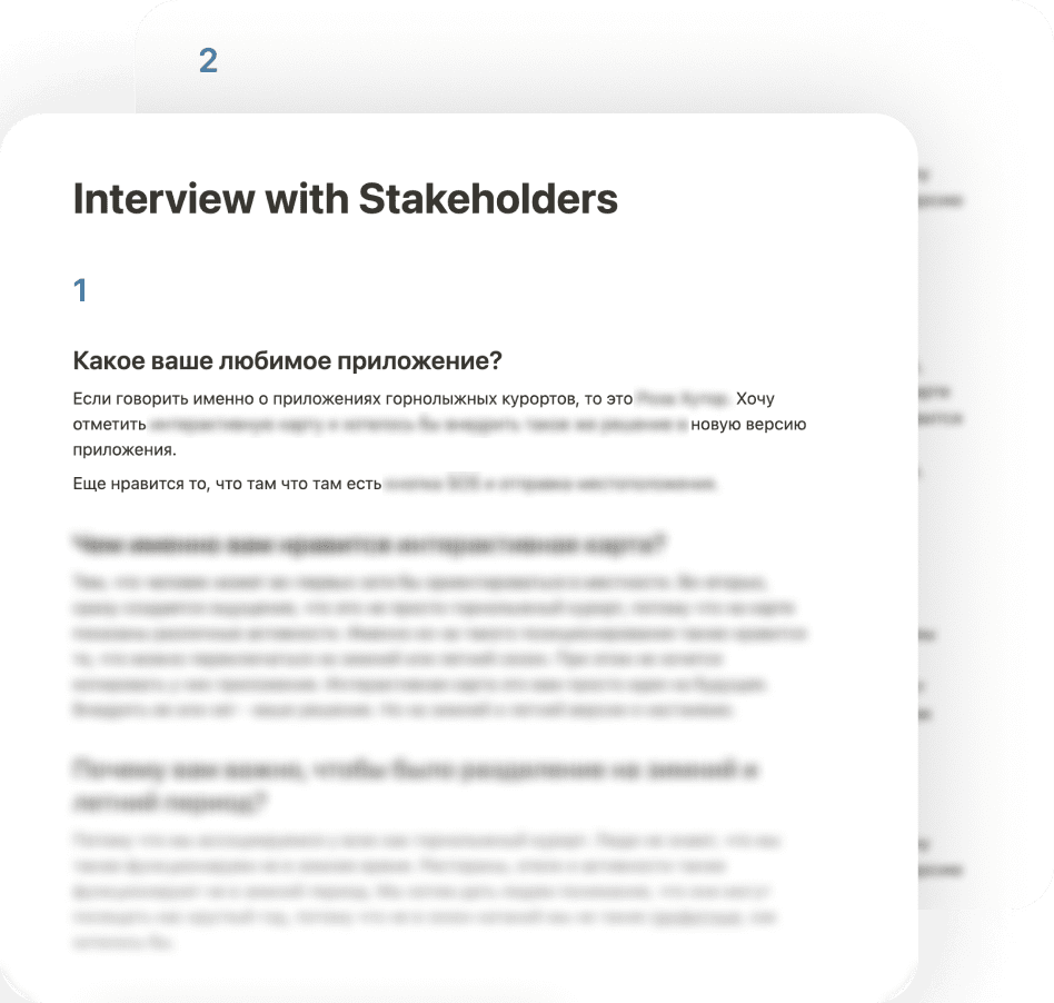
Interview with Tech Lead
The resort was integrated with a particular system known as Axess. I interviewed the person responsible for this part of the project to understand how the Axess system functions. This allowed me to formulate strict technical requirement to our team.

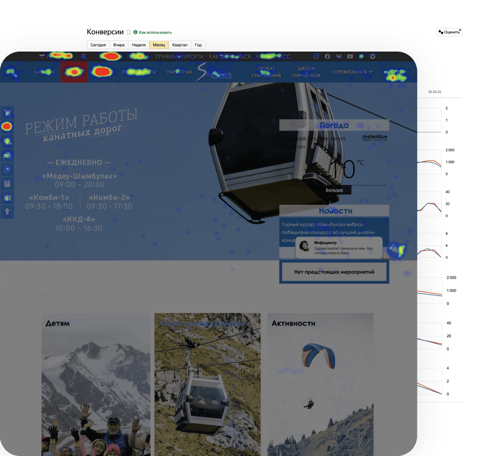
Analytics Review
Analysis of the current website was conducted with multiple metrics in mind. Firstly, I dug through historical data, looking for user pain points and barriers to conversion. As an example, the home page of the website and app both lacked essential information.
Furthermore, engagement of the current and previous versions, was analyzed with heat maps and scroll maps dating back several years. This also provided me a good understanding of the effect of specific changes iterated upon in the past.
Usability Test
I ran additional rounds of usability testing. This helped to give us better ideas for elements to test and ultimately incorporate into future iterations of the design. Together with quantitative data, this information was used to triage the most important elements for the next iteration.
The time to reach the target for each iteration was also noted to better plan the scope for future versions.

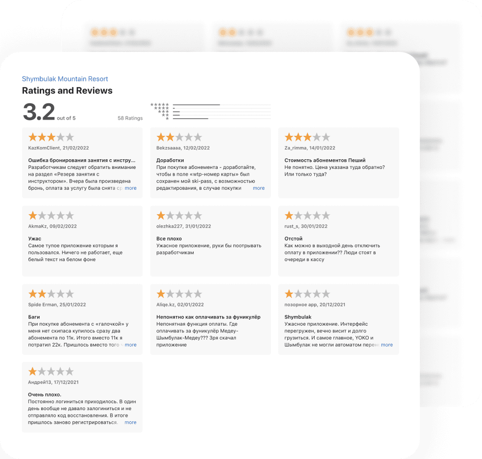
Unsolicited Feedback
Reviews from App Store and Play Market were collected and analyzed. I have always prioritized unsolicited feedback for its genuine nature and passionate roots.
Competitor Analysis
The redesign was guided by my analysis of eleven direct competitors, based on a wide array of attributes.
My analysis showed that the most important factors in the selection of a competitor was a high rating in the stores, number of downloads and the overall global ranking as a ski resort.

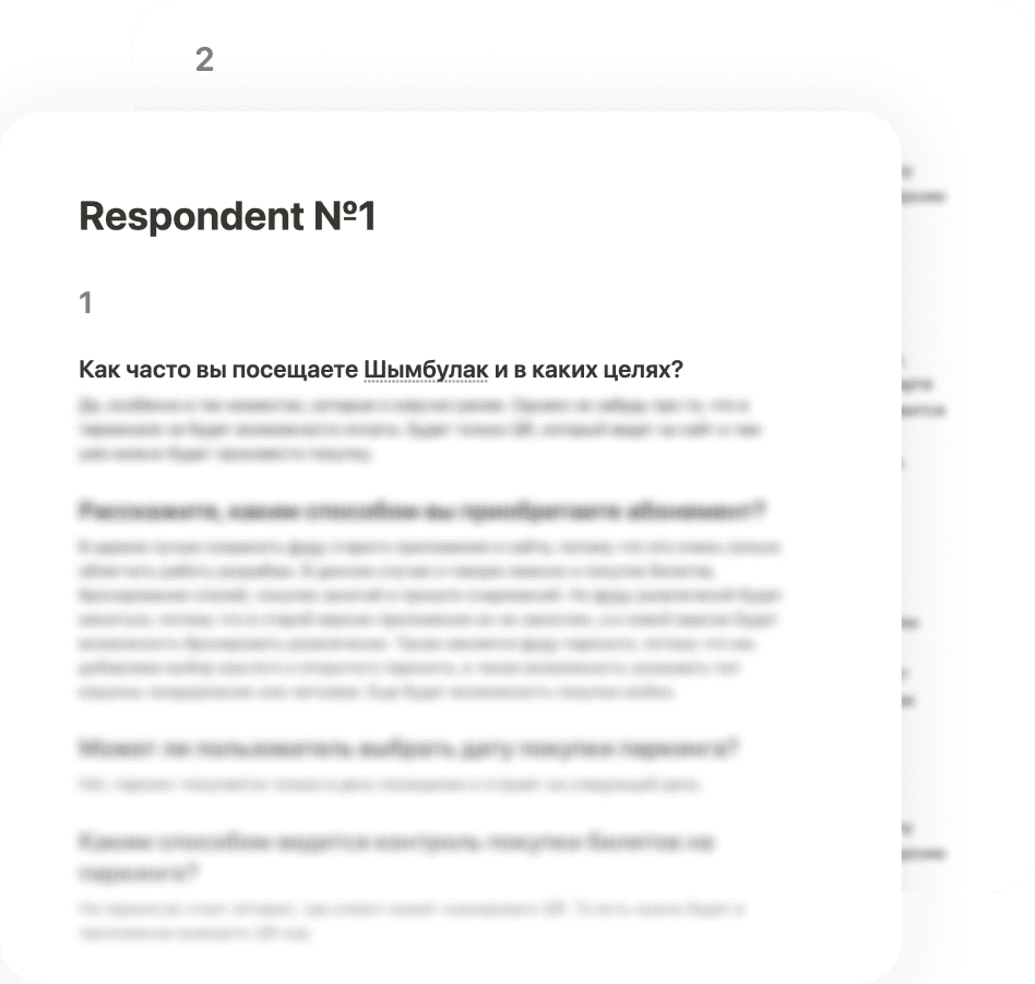
Interview with Clients
I now proceeded to study behavioral patterns and the experience of interacting with the product to better alleviate user reported issues.
User Flow
In offering the user the best navigation experience in our design, I considered an efficient way to move between screens.
This step also helped the team and all stakeholders became familiar with the main scenario and functionalities.
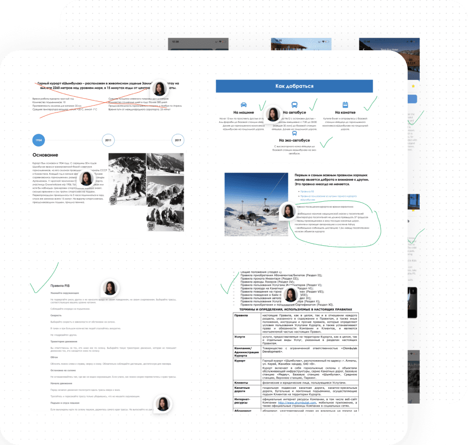
Content Audit
Creating a more intuitive information architecture starts with understanding what components of the old site, app and content must be removed or refactored. I ran a content audit across all existing information and features to formulate the content redesign.
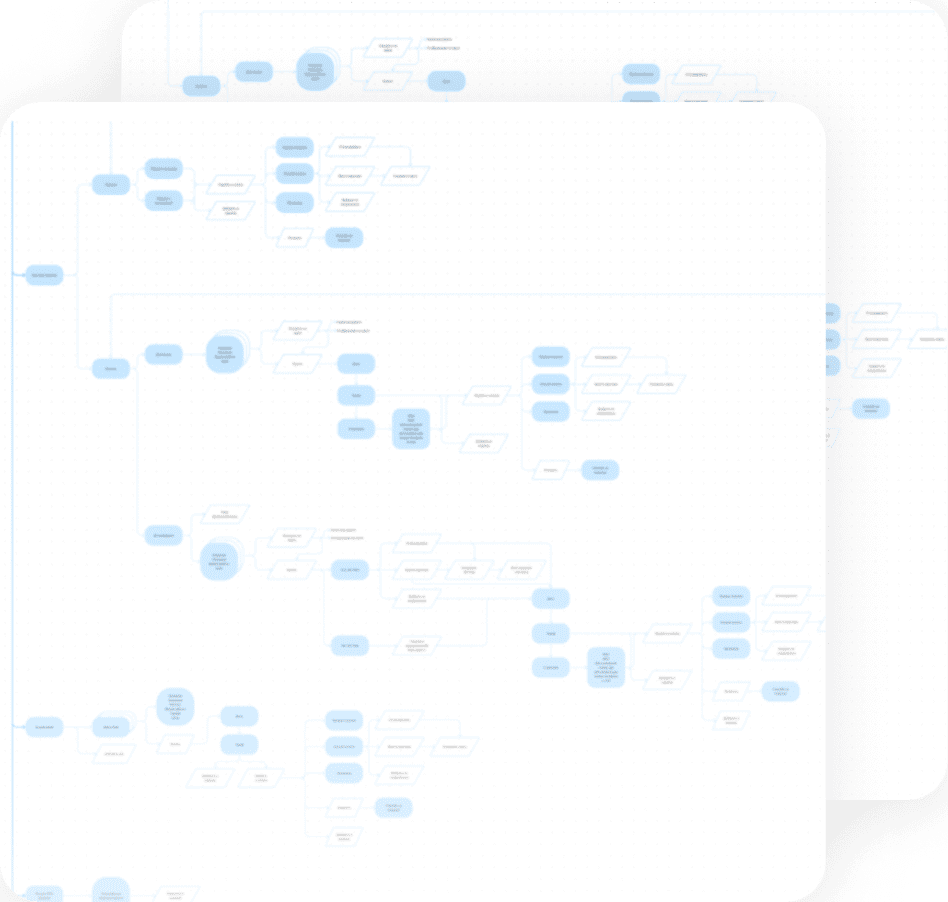
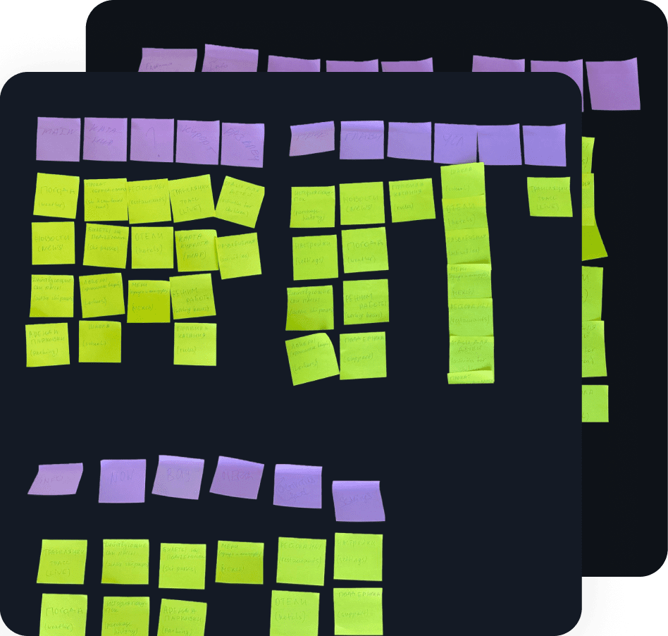
Card Sorting and Information Architecture
After the content audit, hybrid moderated card sorting was conducted to create an Information Architecture that meets user expectations.
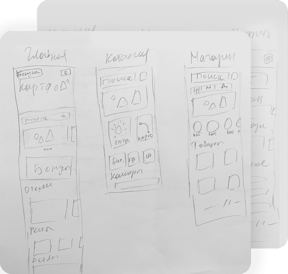
Lo-Fi Wireframing
I produced wireframes for multiple design variations that were presented to users and internal stakeholders for testing and feedback. Three selected variations guided me to establish a single unified design framework.
Finding a Visual Style
The design at the time was out-of-date, and at the request of the client, we created a brand new visual identity for the product.
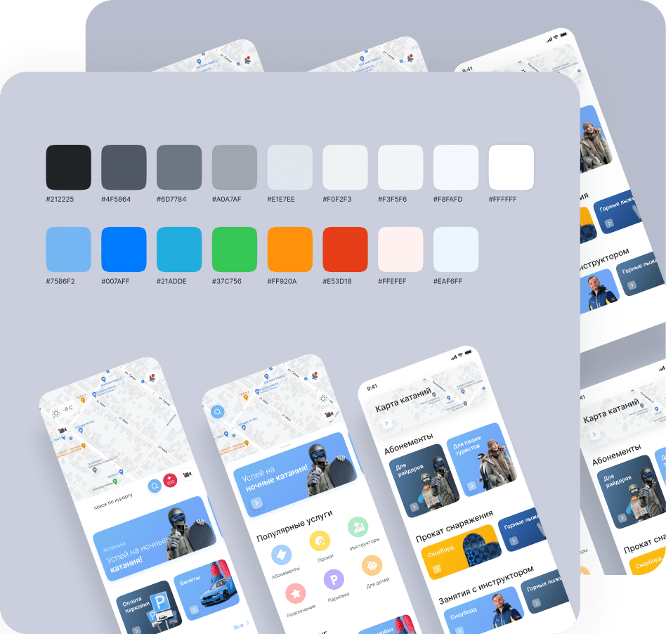
Creating a Design System
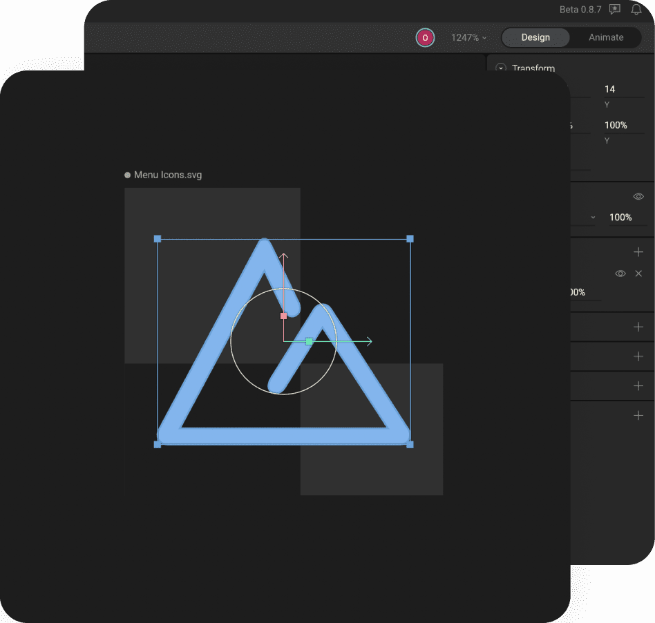
The new design system was implemented following the Atomic Design Methodology. We started by building a catalogue of tokens: patterns, colors, text styles, icons, and grid systems, this gave us a set of design guidelines to promote a consistent design language.

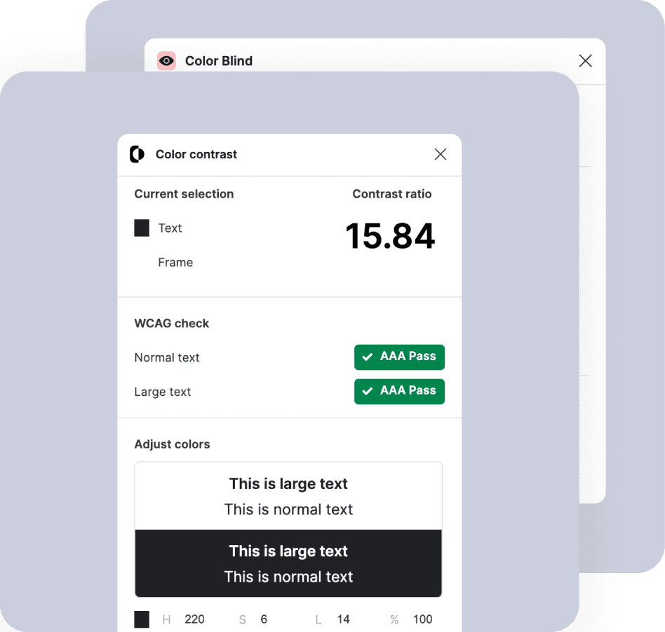
Accessibility
Using an array of accessibility-focused tools, I tested the design for multiple forms of color blindness and compatibility with screen readers.
Interaction Design
In this iteration, we used interactions to bring the page to life, draw users into the content, and help confirm user actions.
All interactions were created in Figma Prototype.
Motion Design
The relationship between the user and an interface, whether human or digital, always combines a set of actions and reactions. We implemented the connection between these actions and the expected reaction on the user side with the help of Lottie and Rive.
Usability Test
Using an interactive prototype, we again conducted usability tests with users to compare the results with the old design, and identify any errors in the new one.
Even though this time users reached their goals faster, the tests indicated inconsistencies with the flow of shopping cart modifications that I promptly rectified.
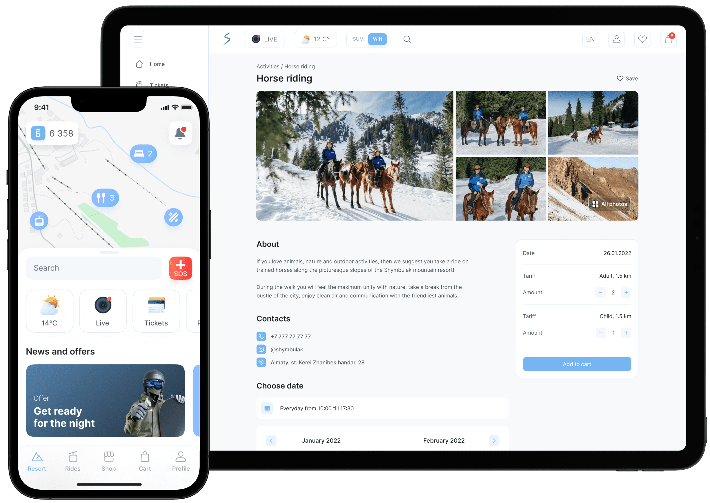
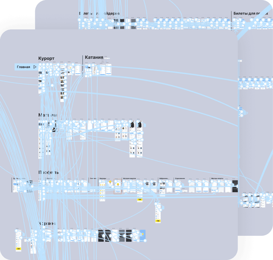
Final Design
The final design was prepared following the usability testing and approval by the client. For the convenience of the developers, the design was divided into user flows.

Design Transfer Process
The secret to successfully managing the design transfer process is to start before you have officially finalized the design phase.
Therefore, already at the early stages, negotiations were held with the developers to inquire about various feature: “can we implement ‘this’ or ‘that’ feature within the given time frame?” After the design itself was completed and a document with comments submitted, a final meeting was held.
Design review
(in progress)